
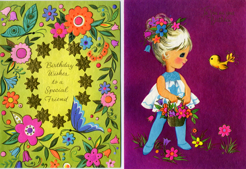
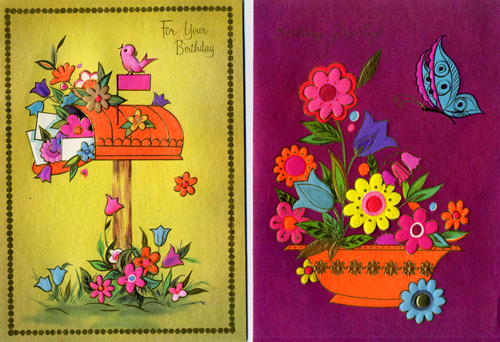
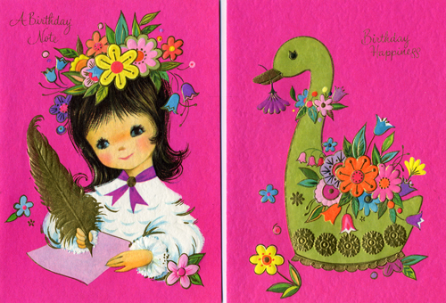
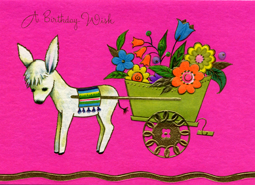
These are fantastic bright pieces from "A Sunshine Card" - where there is no limit to the retina burning neon awesomeness. Sometimes I wonder why design culture doesn't revisit some of this amazing stuff more often. - like - revive this sweet, sweet party-time amazingness, PLEASE!
I'm incredibly inspired by 50s - 70s illustration, particularly on wrapping paper and greeting cards. The only thing better than this is what they say inside.
"Younger than springtime - that's you. Happy Birthday"
Did you see that Walgreens has a vintage reissue section in its greeting cards department? I almost bought them all just for their glittery, swirling flourishes and embellished script!
ReplyDelete