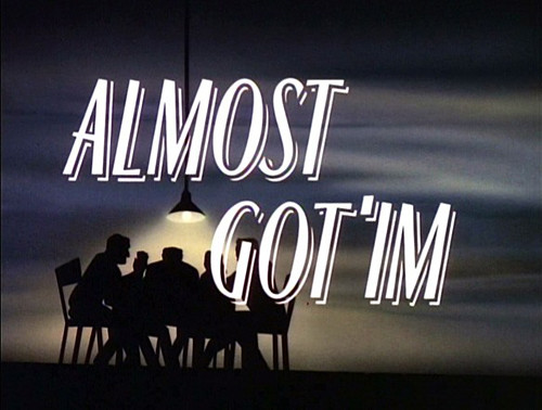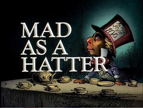

With influence in noir film, 30s-40s design style and a score by Danny Elfman, the show retains entertainment quality. The stylization is really appropriate and enhances rather than cheapens the stories. A number of the stories themselves are really good, too!
It was also a relief to know it's available on Amazon.

Ha! 'Almost Got 'Im' is my favorite episode! Just for the scene when Killer Croc tells his tale. "I threw a rock at him!" *glance* *glance* "...it was a big rock."
ReplyDelete